Salon Font: A Vintage Blackletter for Digital Brand Identity
As a UI designer who ships landing pages, SaaS dashboards, and e-commerce experiences, I don’t reach for decorative fonts lightly. But Salon Font is one of the rare Blackletter typefaces that works *with* digital interfaces—not against them. It’s not just nostalgic; it’s intentionally legible, rhythmically balanced, and built to anchor brand tone without sacrificing usability.
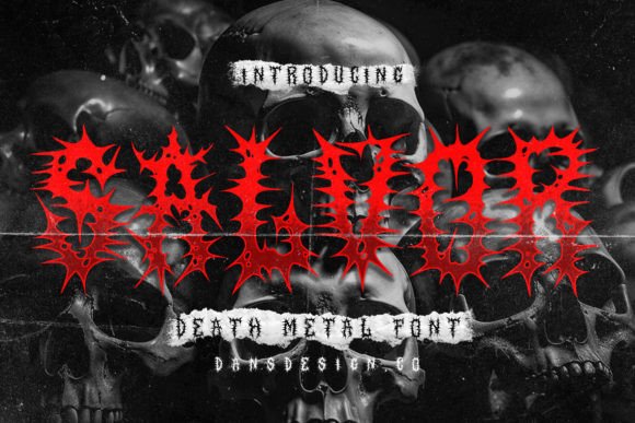
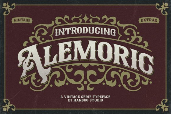
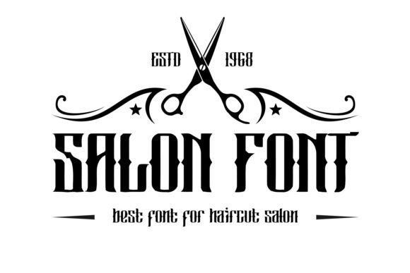
Salon belongs to the Blackletter category—but avoids the density and angular aggression of traditional Gothic scripts. Its letterforms carry soft rust textures, subtle ink bleed, and open counters that breathe on screen. The lowercase ‘a’, ‘e’, and ‘g’ retain organic flow, while capitals hold strong presence without visual noise. That balance makes Salon function well as a display font: expressive enough for branding, restrained enough for interface hierarchy.
Where Salon Adds Real Value in Web Design
In practice, Salon shines where personality and clarity must coexist—like hero sections on creative portfolios, boutique online stores, or premium coaching websites. I’ve used it for headline text over muted image overlays, and it holds up cleanly at 48–72px on desktop and scales gracefully down to 36px on tablet—thanks to its generous x-height and consistent stroke contrast.
It’s especially effective in conversion-focused layouts:
- Landing page headers—paired with a neutral sans serif (like Inter or Manrope) for subheads and body copy, Salon establishes immediate tonal authority without slowing comprehension.
- Product banners in online shops—used for short, evocative phrases (“Handcrafted Since 1923”, “Wild & Unfiltered”) rather than full sentences, it reinforces artisanal credibility.
- Course or membership sales pages—applied to section titles like “Your Journey Begins Here” or “What You’ll Master”, it adds warmth and human texture amid structured content.
- Branded web components—think newsletter sign-up CTAs, testimonial pull-quotes, or limited-edition collection badges—where a touch of vintage distinction supports, rather than distracts from, action.
Readability & Responsiveness: Practical Considerations
Salon isn’t meant for paragraph text—and shouldn’t be. Its charm lives in controlled, intentional application. On mobile, I use it only above 28px for headings, always testing contrast against both light and dark backgrounds. With proper WCAG-compliant color pairing (e.g., #2D2D2D on #F9F7F3), it meets AA contrast standards even at smaller sizes.
Over imagery? Yes—but only with subtle background overlays (10–15% black at 60% opacity) or generous letter-spacing (0.05em minimum). Tight tracking kills its rhythm. For buttons, I limit Salon to primary CTAs with ample padding—never secondary actions or microcopy. And never on small icons or tab labels: its character set thrives in space.
Smart Pairing for Digital Clarity
The strongest digital results come from contrast—not similarity. Salon pairs best with highly legible, low-personality sans serifs: Inter, Poppins, or even system fonts like -apple-system for body and interface text. That contrast creates clear visual hierarchy: Salon sets the tone; the supporting font handles information flow.
For editorial or storytelling sites—say, a heritage food blog or independent publishing platform—I’ll sometimes pair Salon with a warm serif like Literata or Lora for pull-quotes or bylines. But the rule stays the same: one voice leads, the other serves. Never two display fonts competing for attention.
Licensing, Formats & Real-World Deployment
Before integrating Salon into client work or your own product, verify licensing covers web embedding via @font-face or CDN delivery. Most reputable vendors offer WOFF2 files (smaller, faster-loading) and include basic OpenType features—ligatures, stylistic alternates, and multilingual support for Latin-based languages. Check whether the package includes true italic variants (not algorithmic slants) and at least one weight—regular or bold—optimized for screen rendering.
This matters because inconsistent weights break rhythm across breakpoints. If you’re building a Shopify theme or Figma design system, confirm the font file supports variable font axes—or plan fallbacks for older browsers. And always test loading performance: a single 40KB WOFF2 file won’t delay LCP, but bundling multiple decorative fonts will.
When to Use Salon—and When to Step Back
Salon strengthens brand identity for businesses rooted in craft, authenticity, or legacy: ceramic studios, indie record labels, apothecaries, film labs, or writing retreats. It feels misplaced on fintech dashboards or enterprise SaaS tools—unless used *very* sparingly (e.g., a logo lockup or branded report cover).
I avoid Salon for:
- Navigation menus or footer links—too ornate for scanning.
- Form labels or error messages—clarity trumps character here.
- Long-form blog posts or documentation—body text needs neutrality, not narrative weight.
- Animated micro-interactions—its forms don’t translate smoothly to rapid transitions.
Used with discipline, Salon becomes more than decoration. It’s a strategic tone-setter—a way to signal craftsmanship before the first sentence loads. In an ecosystem of generic system fonts and overused Google Fonts, choosing Salon says something specific about who you are and what you value. Not just “vintage,” but intentional.
That intention shows up in how users perceive trust, quality, and care—especially when they’re deciding whether to scroll, click, or convert. In digital design, that’s not just typography. It’s quiet persuasion.